• Skip to main content

Peter Stewart Copywriting

B2B copywriting services for the industrial computing sector

  • Home
  • Why Me
  • Services
  • Samples
  • Testimonials
  • Contact
  • Blog

pumpkinslayer

Aug 03 2020

Autoresponder Analysis #02

Email Autoresponder Message

The previous analysis of a download notification from a lead magnet download form showed one example of an autoresponder email message for a download link request. This time the context is different, which doesn’t shift the whole intent, but changes the approach in subtle ways.

Email Context

The context of an email is important because it indicates different levels of trust and thus how much you can ask for or give to the lead. You can gauge how much they have invested in the process up until now.

In this case, I have already signed up as a member of this site. That means I’ve gone through the hassle of entering all my contact information, then clicking on the confirmation link email. If I was a potential customer, I am probably slightly more invested at this point than a once-off downloader.

Let’s take a dive into the download notification email.

Good

I like quite a lot about this email. It gets to the point and doesn’t sound too corporate.

Subject Line

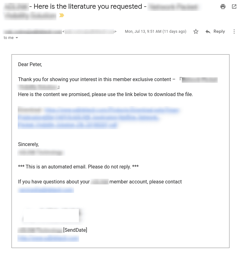
CompanyName - Here is the literature you requested - DocumentName

The inclusion of the company name reminds the person of where this email is coming from. The object of the email is clear. The name of the requested material is listed. All the necessary details are there.

Personalization

Dear Peter,

All good and the syntax is fine. Sometimes the commas get a bit mixed up if the name is missing. I know they always collect first names for this, so missing names shouldn’t be an issue.

Short and to the point

  • Download content explicitly named – blurred bit on the first line
  • Download link obvious – big blue link

Contact details

There is a contact email if you have any questions. Good because it makes it easy to get in contact if you have any questions.

Not so good

A few little nitpicks.

Variables.

[SendDate]

The mail merge variable [SendDate] should be replaced with a real date (or just deleted). The square bracket notation is a common text replacement technique for mass emails.

NOTE: This could easily be prevented through simple testing. Also, send the test email outside your local email system. i.e., if you use Exchange, then send a test to Gmail

Reply

*** This is an automated email. Please do not reply. ***

Setup the email so the recipient can reply directly. It might seem like a small thing, but busy people reading emails don’t really want to jump through more hoops to reply.

It feels like this sort of thing comes straight from a user manual where the poor technical writer is trying to explain away glaring design issues with detailed explanations. However, from a UX perspective, this is just poor practice. It likely points to a poor setup of email delivery systems. Don’t fix the user, fix your email delivery.

Closing Thoughts

As mentioned in the beginning, this email came after I was a registered member of this site, and logged in when I requested the download link. Which begs the question…

Why email?

If I am required to register and be logged in, then displaying a download link directly makes more sense. Remember, there could be a significant wait for the notification email to arrive.

Any decent analytics software would record the download and include it in the client vetting to indicate that this person is interested in certain topics. And then the follow-ups can proceed as usual because the appropriate triggers have been… well… triggered.
Written by pumpkinslayer · Categorized: Uncategorized

Jul 30 2020

Autoresponder Analysis #01

Email Autoresponder Message

Email autoresponders with personalization are intended to mimic the communication of friends and acquaintances. Of course, they are supercharged with automation goodness to reduce manual workload, but they should be written like a human, not a robot.

The autoresponder message was a download link for a case study. Let’s have a look at what is good and what can be improved.

Good

Personalized

Hi [FirstName]

People respond positively to their own name. This also mimics how you would address a friend. “Hey Joe, what time is the party on Friday?” If the first name is available, then use it, otherwise, start to collect them when collecting email addresses.

Easy Reply

"Feel free to reply to this email if you have any questions at all."

At all costs avoid the cringeworthy, “This is an automated message, do not reply.” The message should be low-barrier and low-commitment, so don’t make it difficult.

In this case, the email was a download notification, so get to the point and tell the dear potential customer where to get what you promised them. Make it as easy for them to get back to you if they have a question.

OBVIOUS TIP: Make sure the reply address will actually reach someone.

Not so Good

Subject Line

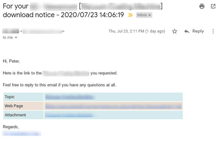
For your ___ download notice - 2020/07/23 14:06:19

The email title, like all titles everywhere, is the gateway to the rest of the content.

You would never email anyone else with this sort of heading, so don’t make the machine sound even more artificial. Try this one instead.

[FirstName], here's your download link

…or…

Here's the case study you requested.

Shocking, I know, but these are sufficiently clear. The date information is just wasted space, and the left out part didn’t make much sense. The date and time information could be included later in the email if absolutely necessary.

Body – Info Table

This table is unnecessary, and doesn’t add any clarity in this case.

The word choice is also poor.

  • Topic – the title of the document from the download link
  • Web Page – the landing page where they submitted their information
  • Attachment – the document download link

Lets try an alternative that includes all the original data.

Just in case, you requested the [DocumentTitle] from [URL] on [Date].

LINK: [DownloadLink]

It’s probably not necessary to include that much information, but sometimes company policies dictate their inclusion, so get them in somehow.

NOTE: Even if the email message is text only, the download link will be displayed as a blue link, making it obvious

Conclusion

Polish up the headline, remove the table, and make the download link clearer. Those will sort out the major issues.

Oh, and don’t forget to track open rates and click through rates.

And please follow up after a few days to see if the download was useful. Or if they didn’t download it, gently remind them. Because that’s what good friends do.

Written by pumpkinslayer · Categorized: Uncategorized

Jul 13 2020

Taiwan Industrial Computing PPC and Landing Page Analysis

Typical Email Opt-in Landing Page

Although PPC campaigns can be used to expose an audience to your brand in a general way, it is terribly difficult to measure the results. Brand exposure is something every brand wants, but if you can’t measure it then it can be seen as something that “everybody does” at best, or a money sink at worst.

My preferred method is the Adsense to PPC Landing Page approach. It’s simple and measurable so it can be tweaked to deliver the desired results. In B2B the aim is usually to get a potential lead into the sales funnel because it takes an average of seven interactions before a purchase is made.

Here’s a simplistic overview of the PPC to landing page process.

  1. Create an ad
  2. Measure ad views
  3. Measure ad clicks
  4. Send to a landing page
  5. Measure action taken on that page

This article on Unbounce about landing page best practices gives a detailed overview of how to design a landing page. Just out of curiosity, I clicked through a few PPC ads on a Google search for “embedded system” to see what I’d see. I focused on those that are hardware providers. Here are the results.

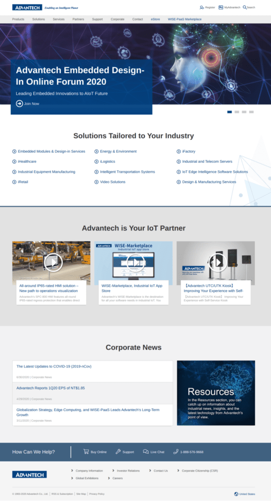
Advantech

Landing page: Advantech Link

Advantech are a big deal in industrial computing, so I would expect them to be doing at least some things right. I like the overall layout that doesn’t present too much information on the page.

The good… the clean design, easy-to-read layout

The not so good… no call-to-action, too many links, no relevance to ad copy

Suggestion… send visitor to specific page, not the homepage

AAEON

Landing page: AAEON Link

Also a big name in IPC, this was one site that made an effort to direct me towards what I was looking for. This embedded box PC page shows me what I’m looking for, which is a fantastic experience for any searcher. However, once there it’s like hitting a shopping site where there’s nothing interesting to watch. B2B buyers are usually on very long lead times because they’re looking to buy in bulk, this page doesn’t help them along their journey.

The good… targeted landing page, content matches ad, clean layout

The no so good… text heavy, no clear CTA, too many links away

Suggestion… reduce text, make images bigger

EPS

Landing page: EPS Link

The top banner does nothing but provide visual stimulation. There’s nothing useful in there. This is the home page and I was presented with a bunch of irrelevant content. The large images are very clear, but I’m also not too sure which one I should be looking at because they are all the same size.

The good… simple, easy to navigate

The not so good… big banner, no focus, no CTA, too many links, dated design

Suggestion… send visitors to specific page, change or remove banner

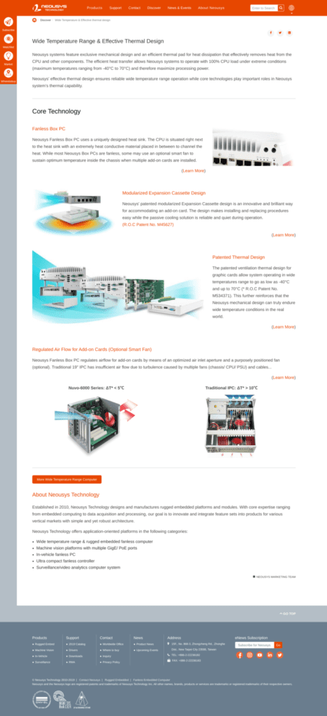
Neousys

Landing page: Neousys Link

This page impressed me the most because of its focus on delivering useful information rather than a product listing. There is useful content on there, but still very product-focused. Wrap up this information into a PDF, then provide it by download in exchange for an email address,

The good… clean design, useful information, targeted, matches ad, limited links

The not so good… no CTA, many links

Suggestion… wrap up content in a PDF and offer for download

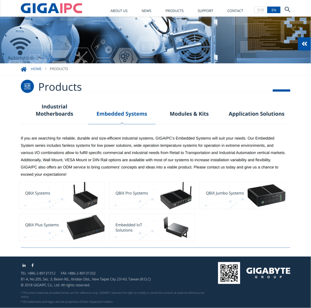
GigaIPC

Landing page: GigaIPC Link

Pretty clean layout from a big player. Very similar in substance to the AAEON site. The page is targeted, but there are also options for looking at other products and a whole bunch of embedded system stuff. I think the extra text must be a “technical” tweak for page relevance numbers because it doesn’t seem to enhance the narrative.

The good… clean, targeted, relevant to ad

The not so good… no CTA, too many links, unfocused

Suggestion… reduce links and reduce text

Some Thoughts

It’s a little surprising that there were no specially designed landing pages to speak of. Not just a page to land on, but a page specifically designed to meet a marketing goal. Although some of these companies did show products that matched the original search for “embedded system” they are at best simple catalogs.

What audience is actually coming to these pages? Most big buyers, i.e., B2B buyers, are looking around, they are not ready to make a purchase, and the last things they want to see is another massive listing of CPU specs, and terms like ruggedized. And if they are ready to buy, they would probably contact a salesperson.

Google is a search engine. People go there to find answers. The person coming to this page is searching for something. Let’s help them out because, in a sea of sameness, it’s the helpful company that wins the deal.

Some Suggestions

Adopt a simple process to optimize the landing page so that people that get there don’t just click away. Display your leadership.

  1. Create a compelling lead magnet such as a white paper, case study, use case, or ebook.
  2. Create a custom landing page to show them how this lead magnet can help them.
  3. Require an email address to access it (and now you have their most basic contact information)
  4. Two days later… follow up to see if it was useful.
  5. Four days later… follow up to see if they have any other questions.
  6. Six days later… begin an automated followup email sequence.
  7. Repeat until… Sale!

Image credit: tswedensky on Pixabay

Written by pumpkinslayer · Categorized: Uncategorized · Tagged: industrial computing, ipc, landing pages, ppc, taiwan

Copyright © 2025

We use cookies to ensure that we give you the best experience on our website. If you continue to use this site we will assume that you are happy with it.Accept